A fictive case with the task of developing a two-page website for an Italian restaurant
Assignment in Web development 1
A three week developing process where I developed a front page and a shopping cart page.
Focus: HTML and CSS, specifically Grid, Flexbox, Media queries, tidy semantic code, and more.
Go to the website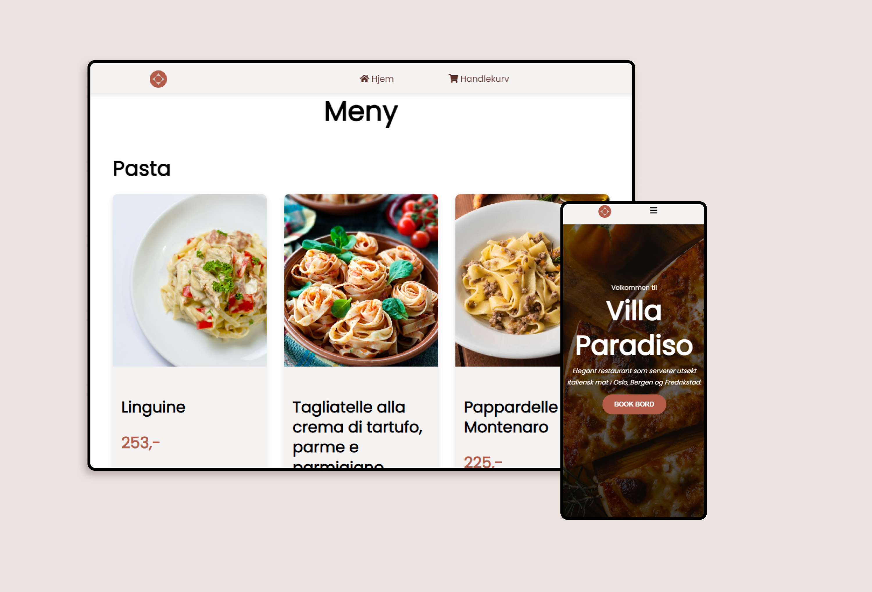
The exam assignment
You are to develop the following two HTML pages:
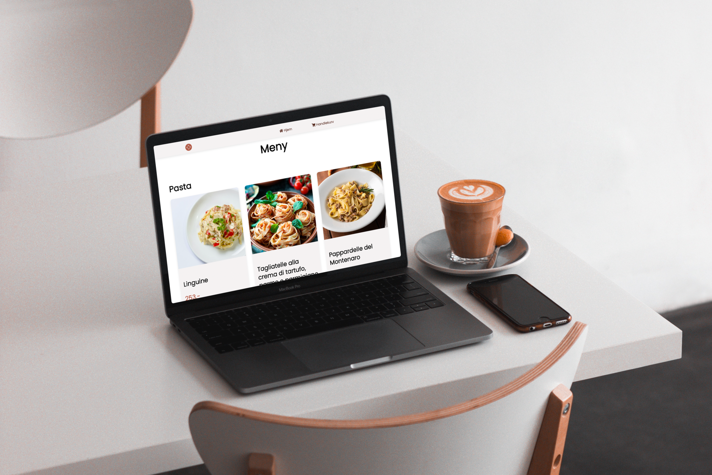
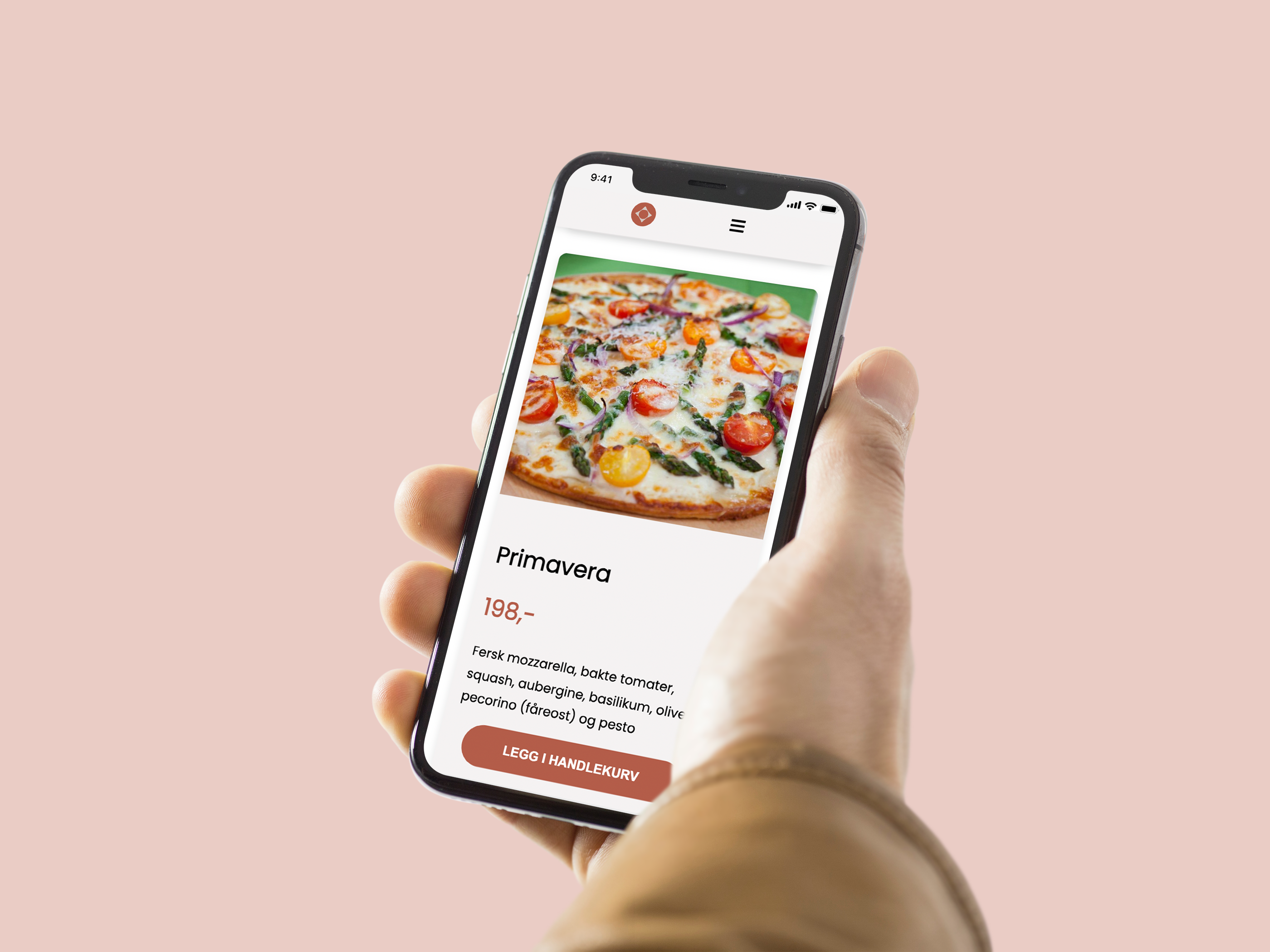
Front page
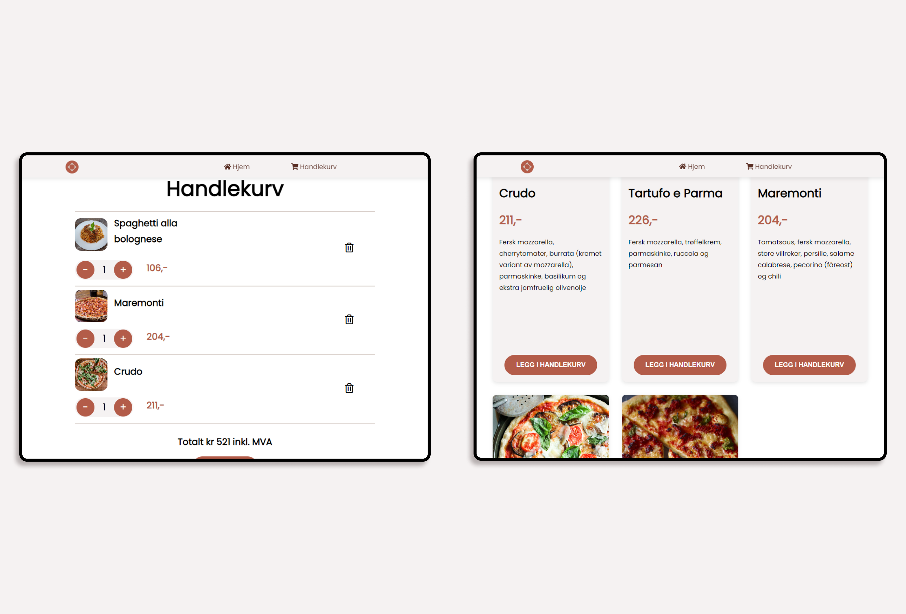
They want a header with logo and navigation menu and a banner just below the header area, which attracts the attention and gives some information. The page should show their menu with pizzas and pastas, and the pizzas and pastas in the menu should be shown in separate sections
Shopping cart page
Create a mockup of a shopping cart (Non-functional).
Requirements
HTML and CSS, Grid, Flexbox, Media queries, Responsiveness, Interaction with :hover, Find and use a color palette, Font Awesome icons, Google Fonts, Tidy, semantic, concise, and structured code.
The result
Evaluation: Pass
The end result is a responsive two-page website with smooth animations and a clean design with a soothing color palette. The site works on every screen sizes through the use of CSS Grid, Flexbox and Media queries.
I am very pleased with the final outcome, and I learned and gained a lot of experience in layout and responsive design and development using CSS Grid, Flexbox, Media queries and Sass.
Go to the website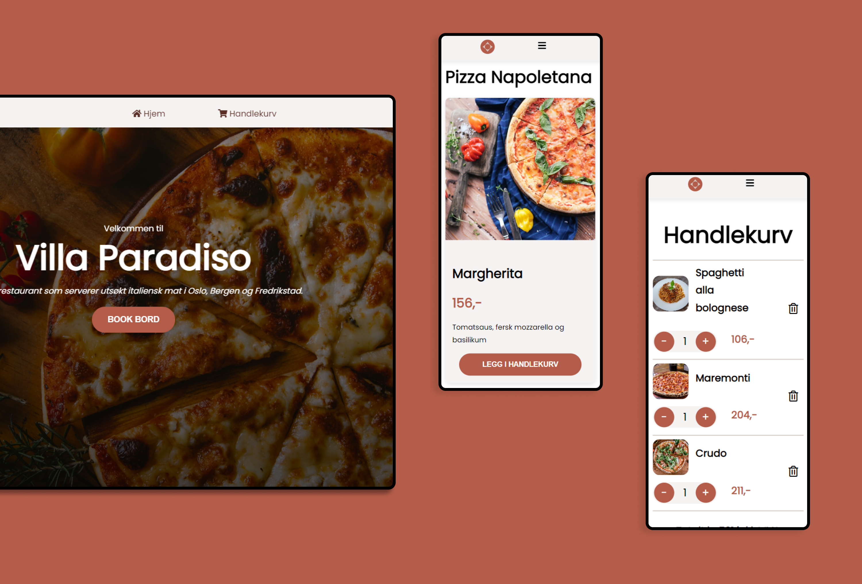
"Nice, simple code, good use of semantic tags and divs"
Rolando Gonzalez, Lecturer in Web development 1, Høyskolen Kristiania
How I approached the assignment
To complete this assignment, I started with developing the layout of the website and went with a desktop-first approach, as the layout was fairly simple and consisted primarily of a grid, as well as nested div’s with Flexbox. The mobile-first approach is also a great approach because of the ease of scalability and it forces you to think about the site’s core requirements.
I used Sass to style the components, pages, layout etc., and I created a very organized Sass folder structure at the start of the project.
Before I created the shopping cart page, I sketched the layout including a visual representation of all the div-tags. By doing this, I was able to see which elements and div’s were supposed to be nested inside which div and what flex direction they were supposed to have. This helped me later with making the website and layout responsive through media queries.