Research
Understanding Moment
As Moment is a complex product, we started with exploring the web and mobile app to gain a deep understanding of Moment.
We did a heuristic evaluation and wrote down our assumptions regarding problem areas.
Bachelor’s project
After the rebrand of the project management provider Milient, I lead a team of two designers as we redesigned their mobile app.
Our task was to improve the UX and mordernize the UI in line with their new design manual. The task was also to create a design system and to design a long-awaited Travel & Expense feature.
Year
2023
Time
4 months
Team
3 designers
Client
Milient
My role
UX / UI designer
UX researcher
Team lead


The client
Milient is the leading project management provider in the Nordic region.
Their products are the web app Moment and the mobile app Moment Mobile.
Milient offer timekeeping, resource planning, quality assurance, staffing and recruitment.
The client
Moment and Millnet merged into Milient.
One of their forward priorities was to focus on UX.
Milient’s customers have said they want an improved mobile app.

The challenge
With a new brand and focus, Milient has assigned the team a three-part challenge to improve the UX for Milient’s mobile users.
Redesign
Improve the UX and visuals of Moment Mobile
Design system
Base the system on the design manual from Snøhetta.
New feature
Implement the Travel & Expenses feature
My role
Research
As Moment is a complex product, we started with exploring the web and mobile app to gain a deep understanding of Moment.
We did a heuristic evaluation and wrote down our assumptions regarding problem areas.
 Moment Mobile (Old design) (PDF)
The client
We gained insights into what the users are accustomed to and expect from similar products. We also identified areas of improvement where we could offer a superior user experience.
Research
Based on information from Milient we defined the target audience to know who we were designing for.
Demographic. Project-based companies and industries. Architecture, engineering, consulting, accounting and IT.
Geographic. Located in the Nordic region and is from 🇳🇴🇸🇪🇩🇰🇮🇸🇫🇮.
Behavior. Uses Moment Mobile. Uses the travel and expense feature.
Research
We conducted 6 interviews to discover problems and opportunities in the user experience.
Goals. What do the users think about Moment Mobile? How do they use the app? Where do they feel there are challenges and opportunities? Do they agree with our assumptions regarding problem areas?
Challenge. Milient didn’t want to disturb their customers, so we interviewed Milient employees. This limited our ability to discover real user needs.

Research
We created survey questions based on the interview insights and sent the survey to Milient employees, because we couldn’t send it to customers.
Purpose. Gather quantitative insights to prioritize and define the scope of problems. Validate the findings from the interviews across a larger sample size.
Challenge. Due to low response rate we couldn’t generalize the data. Instead, we focused on the insights from the interviews.
Research findings
Register absence. People want to be able to register absence from the mobile app.
Consistent time format. Right now, the web and mobile app displays different time formats when timerecording
Timerecording for multiple days. Some people timerecord all in one go. This process needs to be easier.
Scannable timesheet. Users needs to be able to easily see the registered hours, and the total hours for a day, week and month.
Modifying timerecords. The process for deleting and editing timerecords needs to be more intuitive.
Customer. People want to take notes and edit customer information.
Project tasks. People want to see the tasks for a project.
Filter. A good filter function for projects, tasks and customers is important for efficiency.
Travel & Expense. People told us they want the whole process of creating claims and expenses.
Design. Several people wanted the app to be more attractive.
Login process. The login process needs to better with SSO authentication and ability to reset password.
Ideating
Based on the insights we created user stories to capture user needs and perspectives in a concise format.
We transformed them into "how might we" questions that invite creative thinking.
We used these questions in our brainstorming sessions to create ideas for solutions. We brainstormed individually, then chose and refined the ideas together.


Placeholder
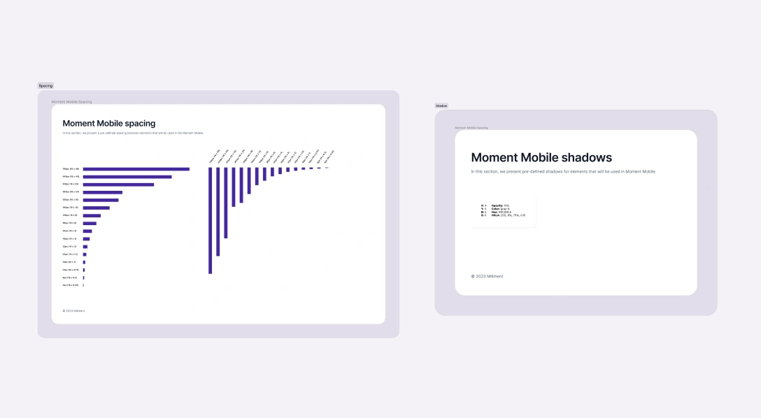
Before we turned the ideas into prototypes we created the design system for spacing, colors, typography, effects, grids and components. The components were based on Ant Design UI library.


Branding
This design system was based on the design manual from Snøhetta.


Prototyping
The team refined the ideas by creating wireframes. This allowed us to explore different layouts and to ensure better clarity among team members
Before we created the prototypes, we created a site map which helped us get an overview over the navigation structure.

Then we created clickable prototypes in Figma based on the wireframes to test the ideas with users.
While we prototyped, I taught the team about Figma's features, including Auto Layout, Components, and Styles.

Testing
We conducted 5 usability tests to...

The tasks were realistic scenarios, and included...
The process of creating travel claims with expenses.
Navigation and information architecture.
The timesheet and the timerecording process.
The process of creating tasks.
Challenge. Finding participants were challenging as we weren’t responsible for the recruitment.
We tested with 1 Milient customer, and 4 Milient employees to overcome this challenge.
This limits the ability to learn about the customers, but we still get valuable insights regarding usability.
Placeholder
After ranking, comparing and prioritizing insights we arrived at these main findings...
Timerecording. People had difficulty finding the absence registration button. They also didn’t tap the switch to timerecord for multiple days.
Timesheet. A few people disliked the week navigation tabs, and found it strange that "today" was separate from the rest of the week.
Customer main page. People wanted more relevant information for the customer main page.
Creating a customer note. Participants didn’t find customer activity notes tab right away.
Creating wrong claim type. Some people created a normal claim instead of a travel claim.
Daily allowance expense. People were overwhelmed when picking sub category.
Payment page for expenses. Some found the payment page confusing and didn’t understand the different choices.
Ideating and prototyping
To solve the discovered problems we used user stories and HMW-questions again to ideate solutions.
After this we made changes to the prototype based on the refined ideas.
Testing
We conducted 5 usability tests after we made changes to the prototype.
All test participants were Milient employees, and their roles were in onboarding, content management and development.
Findings
In the second iteration, we found recurring issues from the first iteration, but also observed improvements and resolved problems.
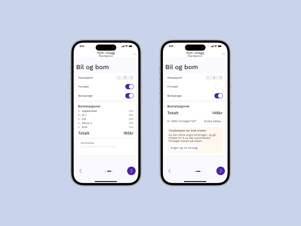
Change road toll amount. A participant wanted the ability to change the automatically calculated road toll amount.
Recurring
Payment page. One person wanted a option that she has paid the expense herself, as none of the options were relevant to her.
Shortcuts. People misunderstood the shortcuts as navigational links, but they were intended for new actions.
Recurring
Daily allowance expense. Choosing sub category was still overwhelming. People wanted more information.
Recurring
Timerecording for multiple days. More people tapped the switch in this iteration, but some still did not do it right away.
Home page. Someone wanted the ability to change the order of pages, so that their most used pages are easily accessible.
Ideating and prototyping
Result
Users now have the option to log in with SSO and reset their password. This was highly requested as the lack of these features caused frustrations among users.
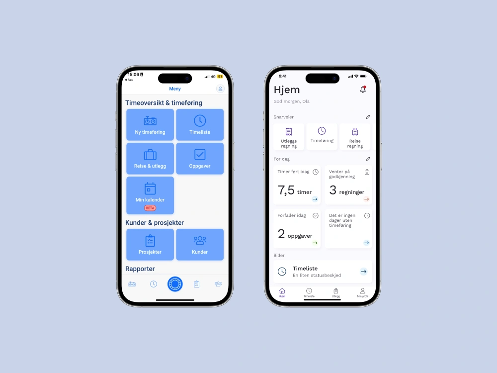
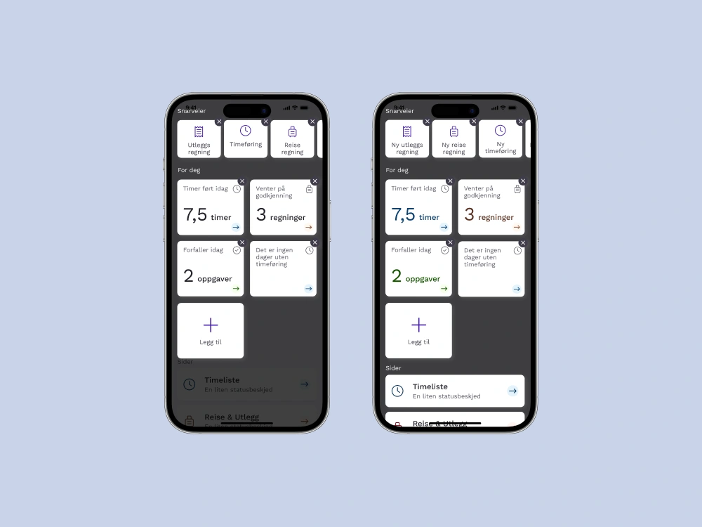
The home page is a highly customizable dashboard with shortcuts, widgets and pages. We discovered that users use the app differently. Different users want easy access to different actions and information.
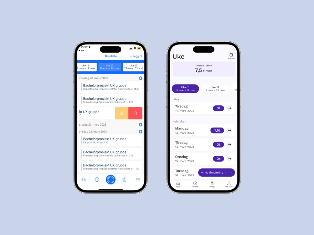
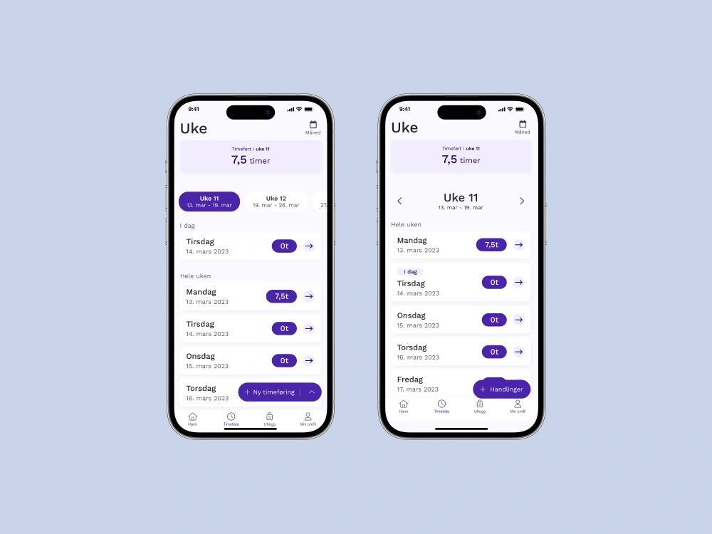
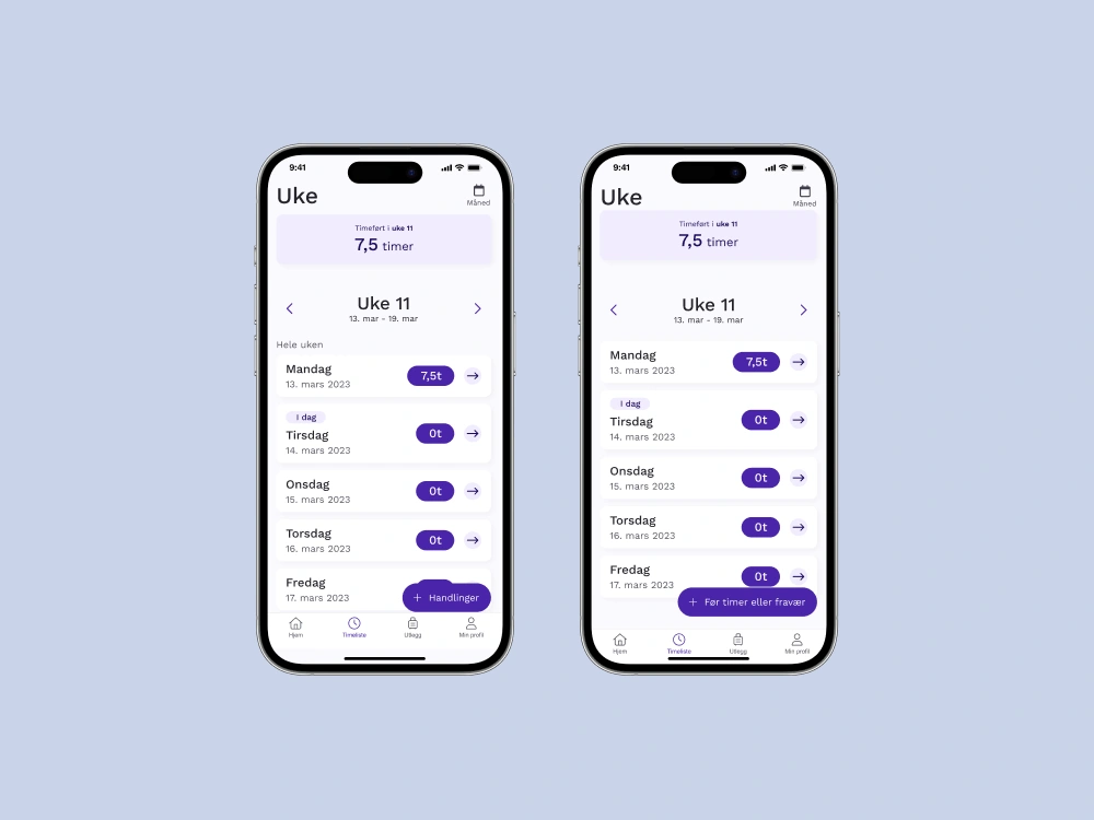
We prioritized scannability, allowing users to easily access total hours for a month, week, and day. Month view was introduced, giving users a comprehensive overview of their timerecords.
Users can now timerecording more intuitively via a bottom sheet, with a focus on better flow, improved timerecording for multiple days and more consistent time format between the web app and mobile app.
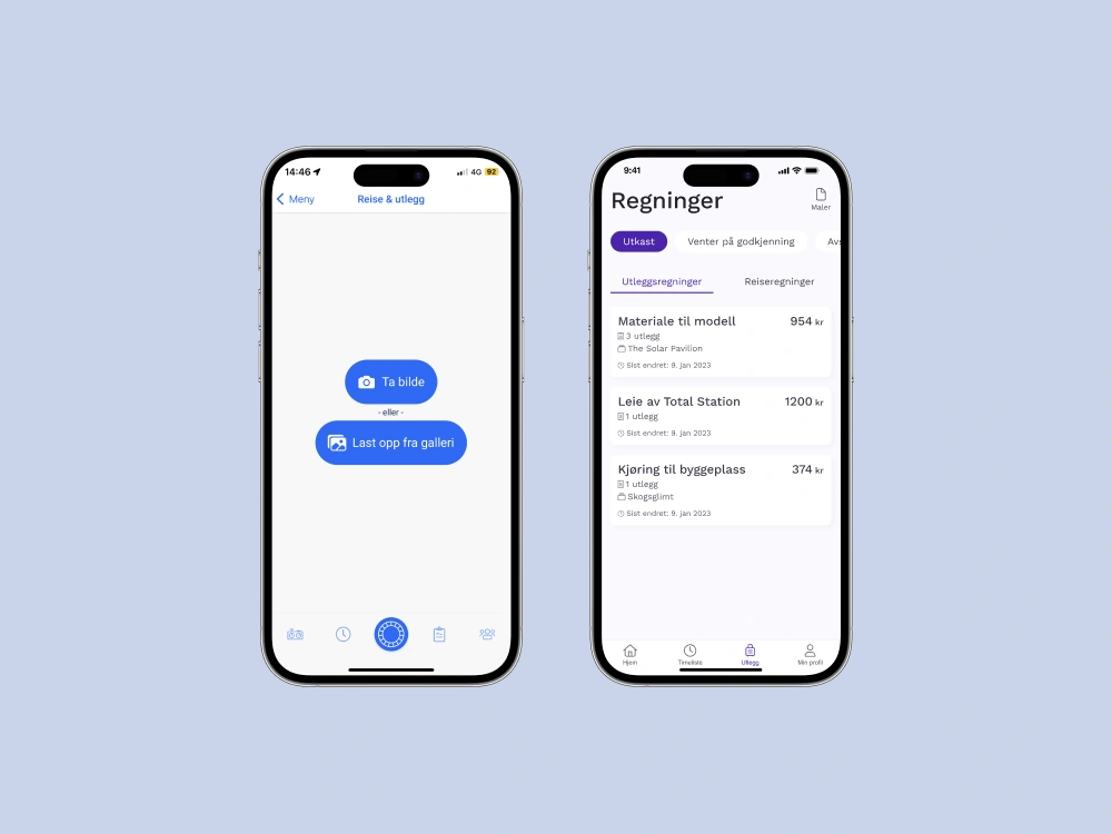
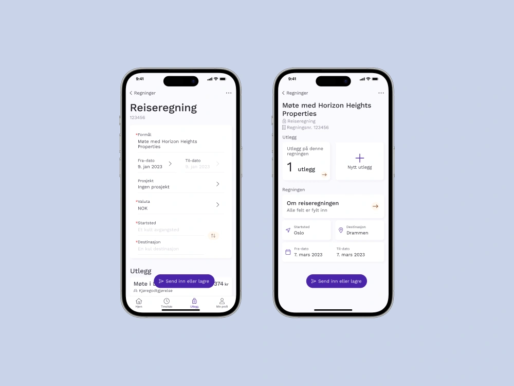
Users can now easily manage their claims and expenses on the go from the mobile app. Our focus was to take the features from the web app and optimize them for the mobile app.
Click or tap to play.
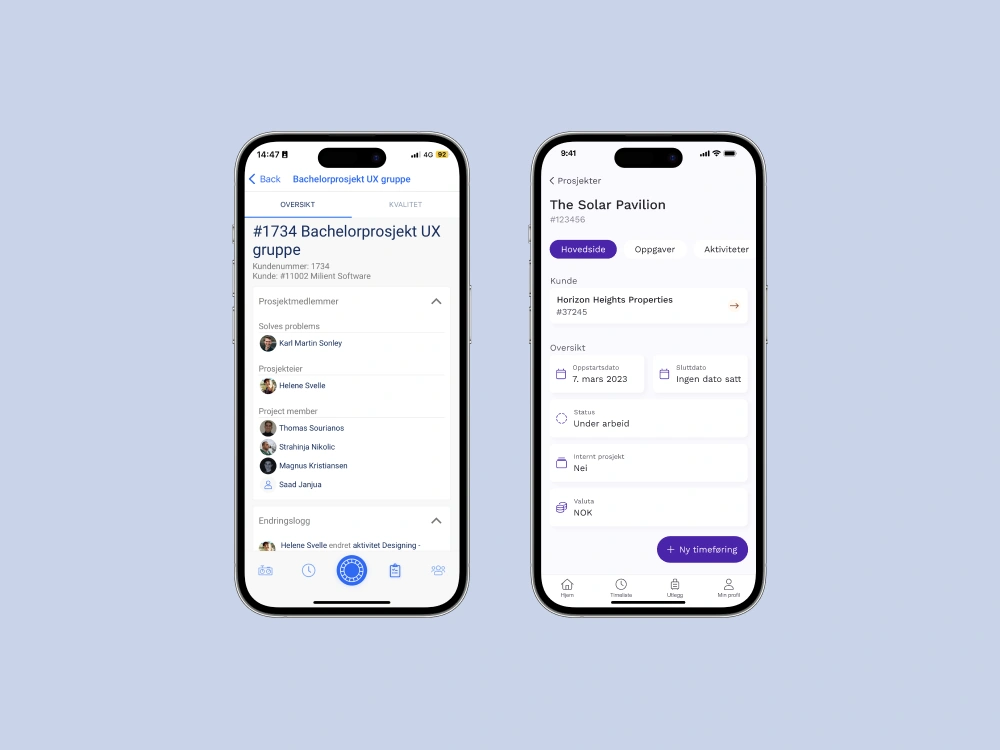
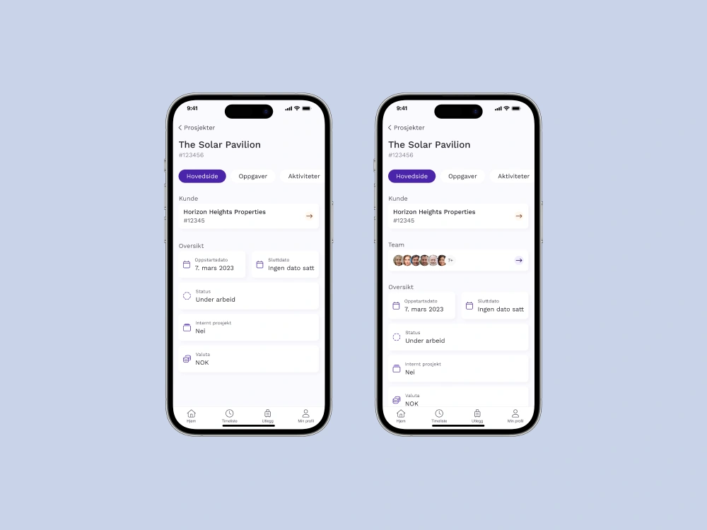
With a new filter function users can easily find their projects. The new project page uses tabs to display the project information to minimize cognitive overload. Users can now track the project's progress with the Tasks and Activities tabs, as this was a need they had.
The filter function for tasks is also redesigned, improving findability for tasks. Task progression is now more scannable. We added Files, Checklists and Nonconformities tabs as this was highly requested.
Users are now able to create tasks on the go, and they can easily skip over irrelevant information if they're in a hurry.
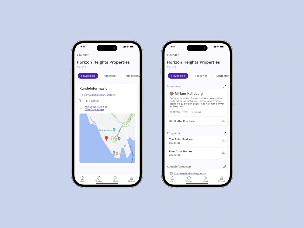
Now users can filter through customers. The main page is customizable and features relevant information. Users are now able to take notes and edit customer details on the go.
Users now get an improved design for their Nonconformities. This is especially important for architects and engineers.


Testimonial
"The team has put in thorough and advanced work in redesigning the existing mobile app to give users a better user experience.
The students created new designs based on our brand new design manual. This work has required a high degree of understanding of Moment as a product and in-depth knowledge of the users, which the student group has handled in an excellent way.
The students have been hardworking and self-driven throughout the project period, as well as a positive contribution to our social environment.
The result of the project is something we look forward to continuing internally, and we believe the students' contribution will lift our mobile app to a more modern level than we have ever had before."
Helene Svelle
Former CTO & Partner
Implement further iterations and test phases to iteratively refine the design based on user insights and ensure a more polished and user-friendly final product.
Prioritize refining the prototype to closely simulate real user interactions. This would create a more immersive and accurate testing environment, leading to more valuable user insights.
Given the limitations on interviewing real customers, future strides should involve conducting in-depth interviews with Milient's actual customers. This would offer a richer understanding of their needs and enable more tailored design solutions.
In the future, extending usability testing to Milient's actual customers would offer a more comprehensive evaluation of the design's usability and effectiveness.
If you have any questions, feedback, or would like to discuss any aspect of this case study further, I would love to hear from you!
Contact me
